
Linux text rendering is borderline-psychedelic when you're blind and zooming in on it. Let's fix this in Plasma.
The above screenshot is essentially what the Linux desktop looks like to me 24/7. That is: rainbowy, blurry, fuzzy-looking text the size of Ontario but with the resolution of a crumb. Why? And what can we do to fix this issue, and cure hundreds of painful Ritchie headaches?
Where do the rainbows come from?
Two parts severe vision loss, one part screen magnification, and three parts subpixel rendering.
Back in ye olde days, when I was a kid, computers had small screens with limited pixel density and - in some cases - were still giant beige boxes. Sometimes, though, you might just be stuck with one of those fancy schmancy LCD displays.
Text anti-aliasing
Here’s what text looks like when you don’t anti-alias it.
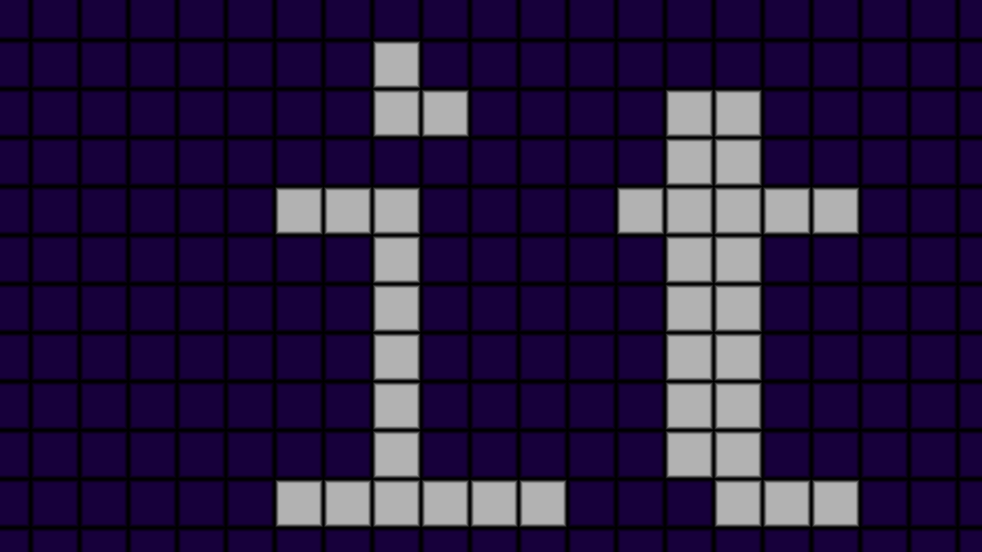
Small text can look unnatural and blocky. Depending on the font, and even the display, this can make certain (or all) characters hard to read. And that’s not ideal.
Here’s what text looks like with grayscale anti-aliasing.
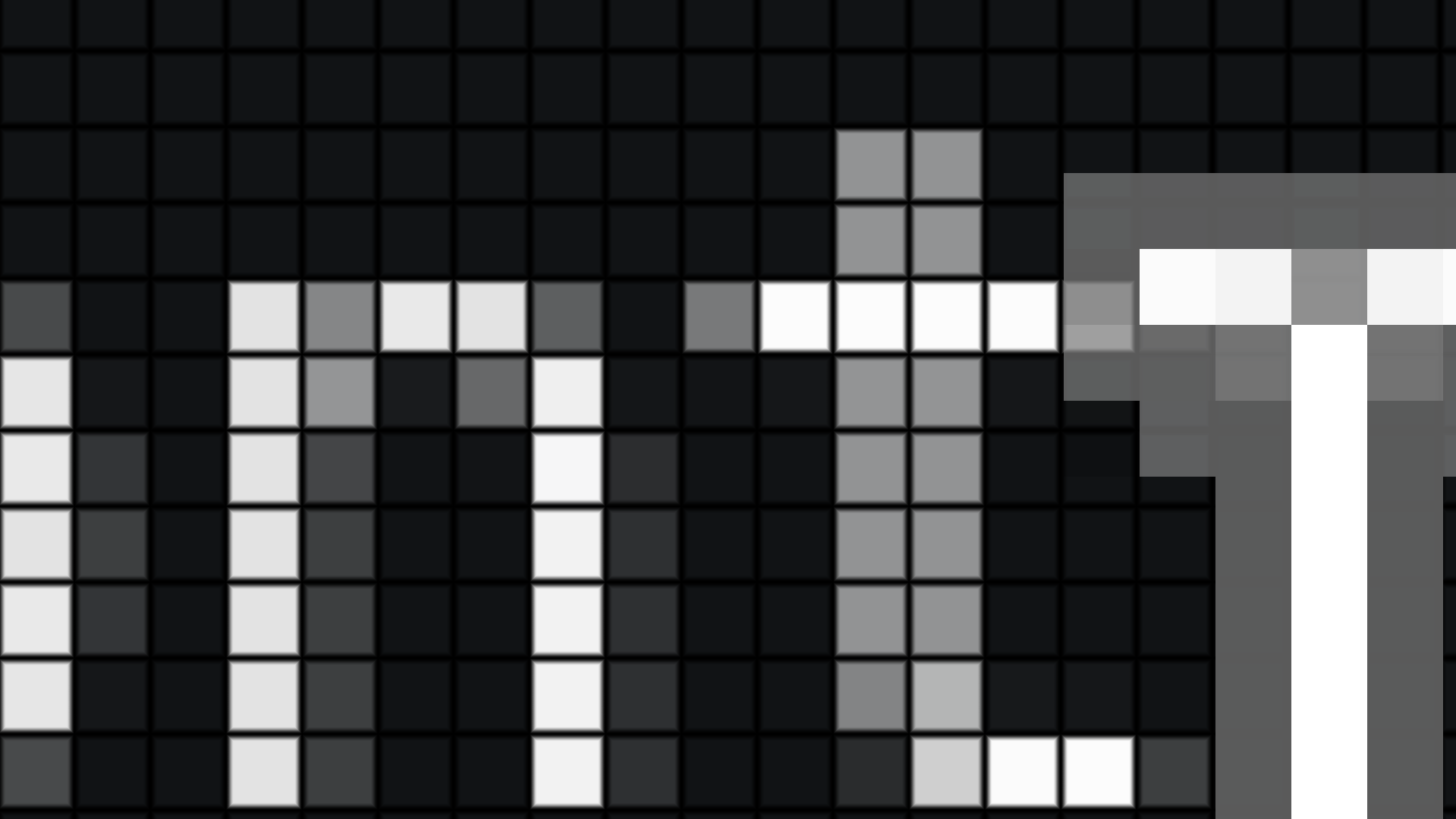
The font renderer tries to smooth out the corners and diagonals of the glyph. This is great, but introduces some fuzziness. Nonetheless, it does the job. For my eyes, however, it’s not ideal. It makes white text appear mostly gray to me, and that’s its own problem.
Ultimately, however, grayscale AA makes text appear far smoother to me and we want that.
Subpixel AA
Subpixel AA, on the other hand, takes advantage of the way LCD displays work. Each pixel is made up of red, green and blue sub-pixels arranged in a certain pattern. Clever manipulation of the red, green and blue channels of each pixel in the rendered character can increase the perceived detail of the font, and improve readability.
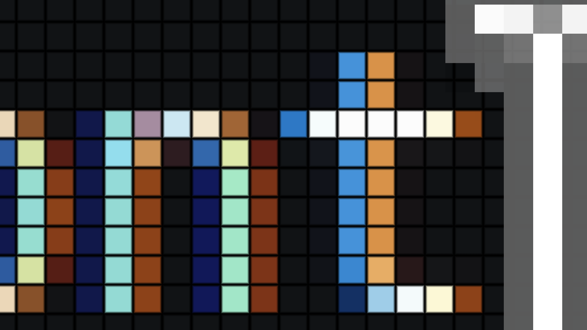
…At the cost of rainbows.
You shouldn’t see the rainbows!
Maybe, if you’re a nerd, you might notice when subpixel AA is in use or not. But ideally, no, you shouldn’t be able to see or be affected by the rainbow effect in the image above. The problem is that I can see them*, and that is a bug.
The zoom isn’t for show.
Each screenshot in this article shows extremely zoomed portions of the KDE Plasma desktop. I was not kidding when I said this is just what Linux desktop looks like for me; this is how it’s been for decades and - once you understand both how subpixel AA works and why my desktop is zoomed in, the problem is obvious.
I am legally blind, and my eyes have a very unique condition that causes vision loss that most software doesn’t know how to account for. There are just so many factors that affect how I see things that it’s borderline impossible to account for everything that affects my perception of color and shapes. It even depends on which part of the eye sees what part of the screen at whatever time of day.
My saving grace is screen magnification and a giant screen. Fonts can be 3 feet tall if I need them to be.
How desktop zoom works
While there are some compositor-specific nuances, especially in how multiple monitors are handled, generally a desktop zoom (the way I use it) is simple.
- You take the actual workspace.
- You scale up the image by a user-defined amount.
- You then translate that image by a user-defined distance. You’re bringing their work into view.
*It’s easy! Capture, scale, move!
Zoom isn’t compatible with subpixel AA.
The core of the rainbow problem is that scaling the desktop image throws off the sub-pixel alignment. Suddenly, what the text renderer assumed would be individual sub-pixels, are now giant clusters of multiple pixels. This is why you see bespoke colored pixels in the above screenshots.
So let’s turn that off. You can do so in Plasma settings. Set the subpixel rendering mode to “None,” and you’ll be back to grayscale AA. Awesome. That fixes the rainbows, my text isn’t blocky. but…it still looks blurry.
Image upscaling causes issues too.
Zoom in Plasma is handled directly by KWin. Normally, KWin will render the zoom effect with a simple bilinear filtering mode. It gets the job done, and makes things appear far less blocky - but it is still trying to enlarge an ijmage that just doesn’t have enough detail, and so you get the usual standard blurriness that comes from bilinear upscaling. It destroys text.
What does Windows do?
I maintain that it is wrong to dismiss the techniques used by other operating systems as being wrong just because we don’t want to o things the way that operating system does. Text is genuinely more readable to me on Windows, so what does it do?
Hint: It isn’t ClearTYpe.
I always thought it was - but there’s evidence from over a decade ago showing that ClearType has been slowly phased out of the Windows desktop and generally is only used sometimes.
What does Windows actually do?
Edge smoothing.
It’s a feature! It’s literally in Settings.
I used to get complaints about having that turned on when livestreaming from Windows. Turns out, it’s what we want instead of the bilinear filtering that KWin does.
Here’s what it looks like.
| Normal image | Zoomed image |
|---|---|
 |  |
| The image on the left is a simple black and white test pattern. The image on the right is what the Windows Magnifier renders when zooming in on the test pattern with “Smooth edges” enabled. |
Whatever magic algorithm Windows is using is likely proprietary or really academic. Either way, it manages to scale the test pattern without making it appear blurry, while trying to preserve the intended shape. Sure, it causes those inner shapes to become triangles, but that may actually be desirable.
Can we smooth edges in KWin?
Absolutely! With a shader.
…To be continued.